Friday, October 21, 2016

Brick Stencil Three Ways

Hi everyone in scrappy-land from Sharon.

I really enjoyed a long weekend away at the beach in mid winter ( seems a distant memory now) and took advantage of a stunning view and a warm fire to sit and scrap overlooking the bay and playing with my latest hippies from Imagine If

In this first page “Shine” I used the brick stencil in the background of a patterned paper, then used brown distress ink to highlight the “grout” areas. I love the dimension that this gives my pages. 


The rest of the page is relatively simple….just some layered paper and a few flowers to finish it off. 

In this second page “Our Story” I use the same brick stencil, this time with modelling paste to create a rustic effect in the background. 


I used some tim holtz crayons to add some shadow in the brickwork. I then used a couple of Imagine If gessoed chipboards. One as a journalling block, and the other to be part of the floral assemblage to the left of the photograph.  I journaled following the circular pattern, and cut the left part of the circle to adhere it to the top of the layout for some repeated elements. Again, I layered papers using the tim holtz distress inks to define the page edges a little.


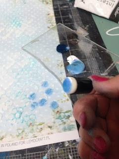
For my third page, I used the stencil again in the background, and swiped some ink on the stencil first to get a graduated colour in the texture paste. 
I then used a piece of gessoed chippie to the left of the photo as the main embellishment atop of layered papers and a little lace. I finished the page with an inked quote from the “quotes and sayings” sheets available in the shop.
As you can see the brick stencil is perfect for applying layers to backgrounds.


Thanks for looking.
Sharon


Monday, October 17, 2016

Inspired by art - Imagine If Blog post

Hi again everyone

Sharon here to share with you a couple of pages I have made lately. 

Firstly I wanted to share with you this watercolour page. 


I was inspired to do this page from the quote I found on of of the “quotes and sayings” sheets  “Life is about using the WHOLE BOX of crayons” . As a painter, I can totally relate to this quote….and wanted to use a photograph of some of my paintings I exhibited at my very first solo exhibition earlier in the year.

I began by sprinkling some watercolour powder over the page in three loose striped areas . I spritzed with water and allowed the colours to mix a little. ( Not too much because I did not want mud!!!!) Once dry I applied texture paste through the “turkish design” stencil using texture paste. The colour from the watercolour seeped through to colour the paste over the top of just the watercoloured areas  which is why I did it in this order. 

I then layered up washi tape and a few pieces of painted chippie to create a "mantel piece" for the photo to sit on. A few doodles around the edge of the page and I am calling it “done”.

The second page I want to share with you uses another “art themed” photo. 


(Photo taken at an art class with an internationally acclaimed NZ  painter. 
Minutes after this was taken, I stepped back to look at what I had done, tripped over my easel, sending the easel the painting and all my brushes and paints into a big drain LOL ….needless to say that painting never made the wall, I just regret I did not take a photo of my whoopsie !!)

Again I used the quote for inspiration, edged in in a coloured ink to add a wee pop of colour in an otherwise neutral coloured page.  I also used several chipboard pieces I had gessoed and painted, along with several die cuts to showcase the photograph. 

Thanks for looking.

Sharon 


Saturday, October 15, 2016

Travel Page

Hi everyone. 
Another travel photo scrapped for the album. This time a photograph from England. I happened to have the Prima Tales of Us paper on hand which was perfect colour and feel for the page, and with the addition of chipboard and stencil work, I could not have been more happy with the final result.


I had lots and lots of fun with this page. I knew immediately that I wanted to use the brick stencil to create a background over the patterned paper. Using crackle paste made the brickwork look old and rustic. 


I loved this chipboard sign that I used to hold the title. Again I just used the white paint to match the crackle paste bricks and the lace. you can find the sign chippie here

For the chip title, I used some minc foil over the top of some “sticky embossing powder” I used a gold foil, to just add a little bit of a “royal” touch to the page. You can find the Family history word here


Thanks for looking

Sharon

Thursday, October 13, 2016

A Beautiful Life

Hi everyone.

Sharon back again with another mixed media scrapbooking page. 
This beautiful photograph of Lake Wanaka did not require a lot of treatment to make it pop. The addition of the imagine if chippie and stencil was just what the doctor ordered on this one . 


I started off with the bubble stencil,(which can be found here) and used texture paste, which immediately had micro beads pressed into it for some subtle bling in the background. 
I used the chip flourish (which can be found here)to accent the photo, and just painted it with white paint to overlap the photograph. 


The title, I used some Minc spray, which was splurged over the title in a distressed way ( Love this title by the way….isn't it such a pretty mix of words and butterflies?) I left the spray to dry, then used the teal minc foil over the top. The foil then just sticks to the spray areas, leaving the others blank. I loved the way the teal beads and the teal title tied the layout all together. The title can be found here
I loved the way the title has the small butterflies entwined in the title, which ties in the butterfly flourish beside the photo.


Thanks for looking

Sharon

Tuesday, October 11, 2016

Summer art journal page

Hi everyone

Hope you have all been enjoying a summer break ( although I think at times we all need a break from summer with these hot temps we have been having!)

I have been playing in my art journal this week, and am going to share with you my art journal page "Summer" .  These are the three "Imagine if "stencils I have used in the making of my page.


The first step is to create a back ground using a variety of acrylic paints, scratching some designs into the paint while wet ( Sometimes, I make my art journal pages on smooth white card, and then glue that into my album ....this is what I did this time ) I have used  various shades of blues and aquas.

Next choose a stencil and using a sponge apply colours to suit on top of the dried back ground. Alter the colours around the page to create depth of colour

Highlight some of the circle shapes using either a white journal pen, or a paint applicator which creates fine lines. 


After the last step has dried, add the circular stencil in the top corner using a bright yellow.....to sort of represent the sun, and then stencil the girls face using a dark colour. ( I used indigo) Once this is dry, shade around the jawline with a black gelato, and smudge to fade out. 

Using a fine paint brush or applicator squiggle some aqua "waves along the base. Use indigo paint to add cross hatches, and "smoosh" around the edges to create a rustic border. Also paint the lid of a spray bottle and stamp random circles in the dark colour.
                                                    

Finally add some red gelato like "lippy" to the  lips, and using a damp cotton bud, spread to fill in the lip shape.
Type out some journalling on coordinating scrap of paper, and adhere to the page. Add another touch of red in the form of a gauze heart to introduce another touch of the red.

Thanks for looking.

Cheers
Sharon

Saturday, October 8, 2016

Mixed media Scrapbook page, step by step

Hi everyone.

Today I am sharing with you a mixed media scrapbook page.

To begin, use some texture paste and spread through the Imagine If Stencil in some random places around the page, and allow to dry. Using a stamp, stamp with acrylic paint all around the page using a coordinating paint colour. Finally stamp with another coordinating colour of acyrlic paint using a sponge dauber to get faint circles. Just stamp in a few places....less is more!!!! Allow to dry thoroughly


Now the scary part!!!!! Spray a couple of coordinating sprays over the dried background. Dry with a heat gun if you are impatient!!


Time to add flowers etc !!!

Cover your Imagine If Chippies with white gesso, then finger paint them with metallic paints in three coordinating colours... I have used Lime, aqua and cobalt blue.  Adhere them and the photos to your page as desired.

FINALLY. the finished page!!! 


Thanks for looking, and see you next time, Sharon 

Travel Page

Hello all.

Its been a long time "between drinks" or layouts in this case !!! But rest assured, I have been busy behind the scenes creating some layouts using the lovely chipboard from Imagine If.

I have been slowly working through my travel photographs from a couple of years ago ( really? that long ago? seems only yesterday!!) Anyway.... this layout is a photograph I took in a park in Edinburgh and just loved the beautiful colours of spring.


This beautiful gazebo chippie was perfect to use in the garden themed layout, and of course this lovely frame chippie was perfect to use as a title holder.
I also used some of the Imagineif stencils in the background. Chevron Stencil and Bubbles Stencil


The page itself started off as plain white piece of paper, and I used blue and white paint to create the background, and used the stencils to add splashes of lime green and black paint.

The chipboard,  I chose to keep simple. I painted the gazebo in white gesso, and then using mica paint, painted the little leaves and the butterflies to highlight them a tad more. The frame I painted in white gesso and added a bit of clear glitz over the top to add a little sparkle. ( Does not show in the photo unfortunately)

Thanks for looking
Sharon

Love.... A blog post for Imagine If

Hi everyone

Sharon here with another mixed media scrapbooking page for you to look at. 

In this layout, I used a photo of my daughter with her new husband . 


I was inspired by the cathedral window chipboard piece , and it was the perfect size to layer over the top of their wedding photo. I foiled the window in gold, then sanded some of the foil away to make it look a little "less clean". I then layered over the top of this photo assembly, the floral corner which I had painted white, then added prima mica powder to the flowers to give them a little sparkly colour. 

The next step was to find a paper to work with the photos, and I luckily had the recent prima collection “tales of us” in my stash. I loved that the images in the paper are almost echoed in the chipboard piece I used at the left of the page. This cut is so very fine and delicate, it suited my page just perfectly. 


Thanks for looking

Sharon